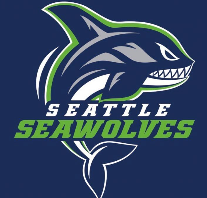
The Seawolves logo is an interesting design to say the least. Founded in 2017, the Seattle Seawolves became the official rugby team for Seattle. Their logo features an imaginary animal, the “Seawolf.” The creature looks like a mix between an orca whale, dolphin, and a shark. The animal is jumping out of the water with chomping teeth and determined eyes. This logo is also featured with a dark blue and neon green color palette.
The Seawolf design is relatively similar to the Seattle Seahawks logo color scheme which was likely a conscious decision. It was a great branding idea for the rugby team because it automatically helps people (who are aware of the Seahawks team) think of Seattle.
In fact, this logo makes a strong case for the importance of brand recognition. Because the Seattle Seahawks are so recognizable — even with people who are not ardent football fans — the idea for using the Seahawks color scheme was genius. Now, sports fans who see the Seawolves logo will immediately think of Seattle. They will wonder whether or not there is a connection to the Seahawks and may even be that much more likely to take the time to look it up. When they find out it is Seattle’s rugby team, it will remain that much easier to remember from that point forward.
When you have opportunities to use color schemes and other data to jumpstart the minds of your potential customers, you have a winning opportunity on your hands. If not, you will more than likely require additional touchpoints down the road to ensure that people remember your brand and connect the dots with what you represent. You want to get to a place where your logo immediately jolts the memory of customers so they can instantly conjure up your brand’s most positive qualities.


